Logo work is always fun, brand identity as well. From startup businesses, apparel and lawyers; a small piece of the large appearance of a business.

Lab Work – Lefty Textures and Patterns
Lefty Lacrosse – Design & Textures, Logo Patterns and more
Lefty Lacrosse – Design & Texture – In addition to our original post, the client was looking for something new, to rebrand the business. After a few rounds of design concepts we settled on this this, the LL reversed with the spines of the Uppercase L back-to-back. This logo not only had a strong visual presence but also proved to be useful in various applications such as on the website, online, print media and merchandise. The texture added depth to the site and helped in brand recognition and usefulness elsewhere (website, online, print media, merch etc.). Texture could be used around the site, bring depth to the site and help bring recognition to the brand.
The logo also symbolizes the ‘apex’ of the mountain, representing the highest point and elevation of the product. The shortened ‘L’ horizontal bar signifies the landscape. The ‘fire-engine’ red color is a nod to the client’s career @lefty at the University Of Massachusetts. Another success of the logo is its ability to stand alone or be used as a design element. Over time we discovered that the logo could be incorporated into textures, highlight elements, high fade/low opacity elements, background designs, and more. This versatility makes it perfect for enhancing website pages and lacrosse merchandise.
Overall, the new logo for Lefty Lacrosse successfully captures the essence of the brand and provides a strong visual identity across various platforms. Learn more about our other lacrosse focused work, such as our league work for the CILL and for Jim’s (Lefty Lacrosse) brother, Patrick and Kennedy Lacrosse.
Energy, Direction and Design
XPF – The Expanded Form Band

Lab Work – XPF
XPF Band – Local VA, DC
Traditional Media • Cover Art • Artwork • Marketing
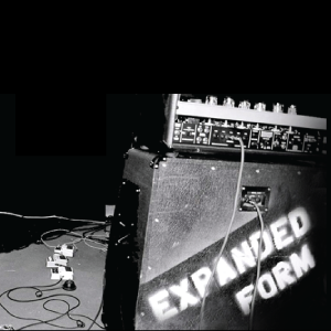
First, there was a local band in and around DC, known as The Expanded Form (XPF). The band was in search of new artwork, new artwork, heavily influenced by the post-industrial era, grunge, and emo scenes. They preferred playing at smaller venues, like small theaters and backyard shows, as opposed to stadium-sized venues. The band was based out of Northern Virginia and consisted of GWU students and more.
Creative Direction
Next, let’s talk about the creative direction. The designs are emotional, meant to embody old world traveling bands that used to tour stadiums. The idea is to simply stencil equipment white spray paint. It’s simple, easy-to-do and easy to recognize on the road. Each piece is lettered to keep track of speakers and accessories as bands moved from one venue to another. The direction was grainy, diffused, and simple. The stenciled letters had fuzziness to them, clear but not clean-edged up close. It’s a metaphor perhaps, spray painted, beat up, washed over and washed out. The second design shared has firetruck red backdrop, stage lighting, bleaching out the frame. This gives the illusion or the viewer the feeling of a first-person view, in the crowd under the lime light.
Heavily Processed, Over-processed; Energy
Lastly, we have the band actively playing, the piece is heavily shopped’ edited, pre-typography, in collage form. It’s a tri-tone creative piece developed as a poster or advertisement for showtimes and ticket sales. It mixes highlights and low light, an over-processed concept featuring white and blue (almost electric blue). Ultimately, the image was created to mimic or capture the stage energy, the raw power behind the music and cohesive sound.
XPF

XPF LP

Marketing

Lab Work – Shaker Heights CC,
Shaker Heights CC a.k.a. SHCC
Web • Membership/Amenities Management • CMS Content Management • POS Point-Of-Sale • Membership/Payment System • Hosting • Social Marketing/Gorilla (less Traditional) Media • Marketing.
SHCC survives today and the club was looking to modernize ‘relations’ with club membership. Funding was the main issue for the membership team and the club as a whole. Strategic funds were secured and pushed toward growth, family activities, family amenities and more. Next a new point-of-sale (POS)system, which included club membership, management and amenities, was purchased.
Ultimately, the upgraded system would help manage the club upgrades, communication and social events, all in line with a broader club initiative of club growth. These enhancements were not limited to improvements but also included securing funds to improve the grounds, the pool, and the surrounding club footprint, as well as forestry improvements.
Thirdly, this redesign introduced the idea of an omni channel approach, creating one ecosystem with the goal of boosting club involvement both onsite and in the virtual space. Additional club offerings and improved golf membership experiences for the families were also part of the plan.
In conclusion, all club enhancements and membership directives focused on improving upon and enhancing the ‘old-world feel’. Careful consideration was given to finding solutions with staying power, refined improvements, and sophisticated amenities that would enhance the overall membership experience. Investments were made in the digital space, management, and logistics services across the club’s ecosystem to create a unified experience unlike any other steeped in tradition and the rich history of the club, the surrounding city and it’s people.

Lab Work – Leadership, Personal Growth and Training
Experienced Personal and Group Instruction by Patrick Kennedy – Kennedy Lacrosse
Web • Hosting • Webmail • Social & Traditional Media • Marketing • Analytics
Kennedy Lacrosse, a local startup business, was looking to advertise beyond the local market. Specifically beyond the limitations associate with non-web related media channels such as the local paper or radio media markets.
A few specific goals were defined, marketing gear for kids and youths moving through the program utilizing mass media and starting a social present on platforms like Twitter, and quickly expanding to sport’s footprint by developing connections back home in NY, specifically focusing on his alma mater and college town of Syracuse, as well as a few areas around the county to grow the sport. The focus was on leadership in the lacrosse community and partnership marketing opportunities at scale.
In hindsight, similar activities were ironed out with another family business partner Jim, the brother and owner of Lefty Lacrosse. Or Learn more about our other lacrosse focused work, such as our league work for the CILL.
In conclusion, once again, Kennedy Lacrosse focuses on young athletes with high-energy, high-sport IQ, a hunger to achieve. Two, learn the ability to successfully execute a plan, delivering results on the field, at home and in the classroom.


