Adobe, Adobe Software – creative, marketing and document management solutions for digital experiences. Changing the world through digital experiences
Puget Systems Video
The Best, Puget Systems
Tech | Tools – Puget Systems Video
We choose Puget. From a far, we can’t wait to get our hands on one of these machines… Saving up for our own custom Puget. See more…
Puget Systems brand computers… seriously, if you haven’t heard about these guys… this is not a paid advert, just a recommendation to check out them out. If money were no object per se, I’d have a top-of-the-line Puget desktop. Maxed out with the latest hardware. I’ve been following these guys for awhile, and they were also featured on a science channel… specifically discussing hardware specifications, customization and hardware potential. Which is great marketing in the social or content creator space on YouTube.
Anyhow, $6000-10000 and you’ve got yourself a heck of a machine. I don’t want to go into great detail here as I’m hoping you will check them out yourselves. For those of you running hot and needing extra power, speed, performance etc., these guys build, test and tune every component to match your needs. It’s truly incredible.
Look up Puget Systems in your free time… if you’re looking for a fully custom machine build. The specs. are eyeopening. Thanks.
Rock The Red
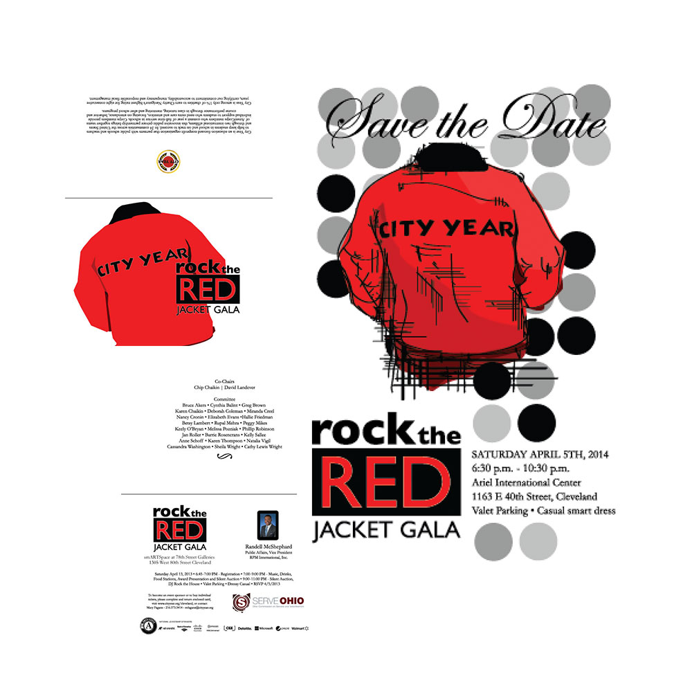
City Year Presents “Rock the Red Jacket” Gala

Lab Work – “Rock the Red Jacket” Gala 2014
City Year, Annual Gala, Rock The Red Jacket
Print • eMarketing Email Campaign • Multi-Layered Event Invitation and More.
I worked with City Year leadership, members, and students to create invitations for the “Rock the Red Jacket’ Gala and a digital campaign. You can find more information about the student leadership association through City Year Cleveland. The goal was to foster connections between students and teachers, and provide resource and information for those involved in the student leadership group. Side note, explore other educational services and work associated with The University of Cal. Berkeley, University School, Supreme Bar Review and more.
Additionally, I personally donated a painting of the city for a closed auction to help raise money and awareness for the association. Stay tuned for more designs. You can view my latest sketches, design work and creations. More to designs to come. Check out my latest sketches, design work and/or creations via X @salleetech. You can also explore other pieces in my online portfolio and other work under the portfolio website tag. If you are interested in purchasing artwork, you can find those pieces or studies under the artwork category.
Find more items like this by using the magnifying glass (spyglass) at the top of the page to conduct a search.
NEOUPA Usability Day Celebration
UPA – World Usability Day (NEO)

Lab Work – UXPA – NEOUPA
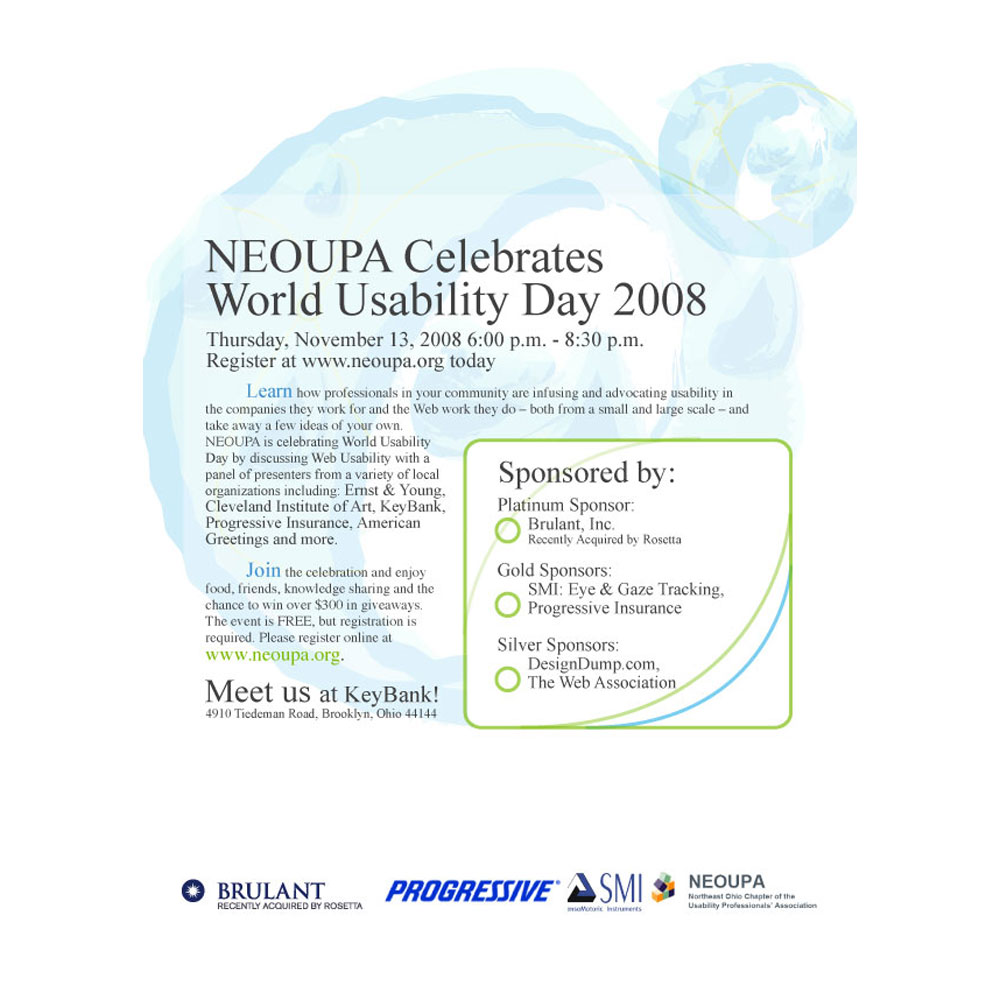
NEOUPA, now, Usability Professionals Association (UXPA) – Celebrating World Usability Day
Print • eMarketing • Event Invitation and More
NEOUPA – World Usability Day 2008. Here you can find information on upcoming events, how to participate, and ways to get involved with World Usability Day.
I became involved in two ways. First I took on an active leadership role as the Experience Chair. Chair for NEOUPA (North Eastern Ohio Usability Professionals Association) and AIGA, The Professional Association for Design. During my term(s), serving both organizations simultaneously, I set goals and established the direction for learning, research, and usability sessions focused on enhancing the user experience. Secondly, I chartered a new course for the two associations by emphasizing the exploration, mastery and integration of three key disciplines: user experience, design, and development. I identified overlapping and distinct skills, worked to enhance and update professional skills, and promoted interdisciplinary collaboration amongst professions in each field. The objective was to bring individuals together, foster collaboration, and enable professionals to deliver exceptional user experiences.
One way to spread the message and direction was through World Usability Day. Here you will find an example of marketing slip, informing the general association, non-members and leaders in the area. Although it’s been many years since my time as chair, I enjoyed learning and networking with other professionals. Today, I retain membership in both – AIGA, and UXPA, as a member at large.
Annual School Gala Presents
‘Make Your Mark’ Gala – University School

Lab Work – US
University School – Make Your Mark Gala, 125 Years
Print • eMarketing Email Campaign • Multi-Layered Event Invitation and More
The goal of the Gala invite was to share the rich history, heritage, and future that makers create at US. The theme, ‘Make Your Mark,’ was coined to convey a message of home for a better life. This life can be created, initiated, and carried out with the values and principles shared by every US student and faculty, solidifying the message of the University School Gala. This annual event focuses on the schools successes, building a brighter future for the makers in our world, and the boys who walk the halls of US. Make Your Mark on the world.
Invitation Design Details

Gala Invite

Gala Inserts
Thank you for reviewing our University School invitation design. Explore other educational services and work associated with The University of Cal. Berkeley, City Year, Supreme Bar Review and more. We appreciate your attention. Check out my latest sketches and artwork @salleetech and progression photos. You can also explore other pieces and artwork under the category ‘artwork’.
Expatriate Concierge Services
The Xpat Desk

Lab Work – Web Work
Local for profit White-Glove Concierge Service. The Xpat Desk, was specifically designed for expatriates moving back to the United States. We assisted in building the marketing, branding and strategic message across various platforms such as the web, marketing materials, presentations, business cards and more (marketing collateral including logos, single-page websites, mailers, brochures, etc).
Our goal was to present one voice, exuding confidence and professionalism in our concierge service. We aimed to create a cohesive team with one brand, offering the highest level of care while looking out for the best interests of the client, their family, and friends. Our services went beyond just helping with the process of finding and an expat’s next home in the States, but also included assistance with furniture, clothing, storage, personal effects, and everything else needed to establish a new home in the United States of American. The Xpat Desk is a white-glove service dedicated to finding all products and services to welcome home expats.
Below, you will find the initial roll out of logos, showcasing a ‘door’ or portal symbolizing a threshold or new beginning. The slight shadow is meant to provide a subtle cue for services available day or night. We chose a traditional font style to blend old-world charm with modernity, symbolizing the journey from beginning to end, starting with a positive, memorable, and smooth conclusion.

Lab Work – Lefty Textures and Patterns
Lefty Lacrosse – Design & Textures, Logo Patterns and more
Lefty Lacrosse – Design & Texture – In addition to our original post, the client was looking for something new, to rebrand the business. After a few rounds of design concepts we settled on this this, the LL reversed with the spines of the Uppercase L back-to-back. This logo not only had a strong visual presence but also proved to be useful in various applications such as on the website, online, print media and merchandise. The texture added depth to the site and helped in brand recognition and usefulness elsewhere (website, online, print media, merch etc.). Texture could be used around the site, bring depth to the site and help bring recognition to the brand.
The logo also symbolizes the ‘apex’ of the mountain, representing the highest point and elevation of the product. The shortened ‘L’ horizontal bar signifies the landscape. The ‘fire-engine’ red color is a nod to the client’s career @lefty at the University Of Massachusetts. Another success of the logo is its ability to stand alone or be used as a design element. Over time we discovered that the logo could be incorporated into textures, highlight elements, high fade/low opacity elements, background designs, and more. This versatility makes it perfect for enhancing website pages and lacrosse merchandise.
Overall, the new logo for Lefty Lacrosse successfully captures the essence of the brand and provides a strong visual identity across various platforms. Learn more about our other lacrosse focused work, such as our league work for the CILL and for Jim’s (Lefty Lacrosse) brother, Patrick and Kennedy Lacrosse.
Energy, Direction and Design
XPF – The Expanded Form Band

Lab Work – XPF
XPF Band – Local VA, DC
Traditional Media • Cover Art • Artwork • Marketing
First, there was a local band in and around DC, known as The Expanded Form (XPF). The band was in search of new artwork, new artwork, heavily influenced by the post-industrial era, grunge, and emo scenes. They preferred playing at smaller venues, like small theaters and backyard shows, as opposed to stadium-sized venues. The band was based out of Northern Virginia and consisted of GWU students and more.
Creative Direction
Next, let’s talk about the creative direction. The designs are emotional, meant to embody old world traveling bands that used to tour stadiums. The idea is to simply stencil equipment white spray paint. It’s simple, easy-to-do and easy to recognize on the road. Each piece is lettered to keep track of speakers and accessories as bands moved from one venue to another. The direction was grainy, diffused, and simple. The stenciled letters had fuzziness to them, clear but not clean-edged up close. It’s a metaphor perhaps, spray painted, beat up, washed over and washed out. The second design shared has firetruck red backdrop, stage lighting, bleaching out the frame. This gives the illusion or the viewer the feeling of a first-person view, in the crowd under the lime light.
Heavily Processed, Over-processed; Energy
Lastly, we have the band actively playing, the piece is heavily shopped’ edited, pre-typography, in collage form. It’s a tri-tone creative piece developed as a poster or advertisement for showtimes and ticket sales. It mixes highlights and low light, an over-processed concept featuring white and blue (almost electric blue). Ultimately, the image was created to mimic or capture the stage energy, the raw power behind the music and cohesive sound.
XPF

XPF LP

Marketing

Lab Work – Shaker Heights CC,
Shaker Heights CC a.k.a. SHCC
Web • Membership/Amenities Management • CMS Content Management • POS Point-Of-Sale • Membership/Payment System • Hosting • Social Marketing/Gorilla (less Traditional) Media • Marketing.
SHCC survives today and the club was looking to modernize ‘relations’ with club membership. Funding was the main issue for the membership team and the club as a whole. Strategic funds were secured and pushed toward growth, family activities, family amenities and more. Next a new point-of-sale (POS)system, which included club membership, management and amenities, was purchased.
Ultimately, the upgraded system would help manage the club upgrades, communication and social events, all in line with a broader club initiative of club growth. These enhancements were not limited to improvements but also included securing funds to improve the grounds, the pool, and the surrounding club footprint, as well as forestry improvements.
Thirdly, this redesign introduced the idea of an omni channel approach, creating one ecosystem with the goal of boosting club involvement both onsite and in the virtual space. Additional club offerings and improved golf membership experiences for the families were also part of the plan.
In conclusion, all club enhancements and membership directives focused on improving upon and enhancing the ‘old-world feel’. Careful consideration was given to finding solutions with staying power, refined improvements, and sophisticated amenities that would enhance the overall membership experience. Investments were made in the digital space, management, and logistics services across the club’s ecosystem to create a unified experience unlike any other steeped in tradition and the rich history of the club, the surrounding city and it’s people.
Lab Work – Doug & The Goodharts
Grab Tickets, Come See The Show – NYC’s Own Douglas & The Goodharts
Web • Social Media • Marketing • Hosting
Following the release of their latest EP, Douglas & The Goodharts (DGH Soul) were seeking to implement a single-source design approach. The approach would allow them to deliver dynamic content across their web site, social media and print materials. They wanted a central hub, like the hub of a bicycle wheel, to connect with various social platforms, their Facebook presence, online music storage and ticket office.
This omni channel offering would showcase in-show media, tour dates, live show mix-media content, new music releases, music archive and more. Find more music local band support and design, visit us here.


